Real Estate Brands
The development of a brand becomes indispensable when the purchase decision can no longer be made on the basis of the pure product characteristics - e.g. with increasing price pressure, increasing complexity or alignment of qualitative and technical standards. In order to meet these requirements, successful brands - as well as real estate brands - arouse and fulfil needs, create worlds of experience and are a personal statement to the outside world.
Strong brands are based on brand values, clear positioning and strong communication. Real estate can also be given an unmistakable character through four factors:
• through a special architecture
• by an exceptional location
• through innovative concepts
• through attention-grabbing communication.
The strong competition on the real estate market increases the competitive pressure so much that the marketing of properties is now often only successful through targeted real estate branding and effective communication.
Furthermore, in times of staff shortages/"war for talents", it is becoming an important field of action for employers to give buildings a positive and meaningful identity in the sense of employer branding. The targeted strengthening and marketing of objects through branding creates orientation and is increasingly becoming a necessity.
BRAND IDENTITY FOR REAL ESTATE
All communication measures should always convey the core characteristics of the real estate brand and be the bearer of a brand identity. The aim is to give real estate a clear appearance and identity that clearly sets it apart from the competition. This can be achieved through communication
• in spaces
• around the spaces
• about the spaces
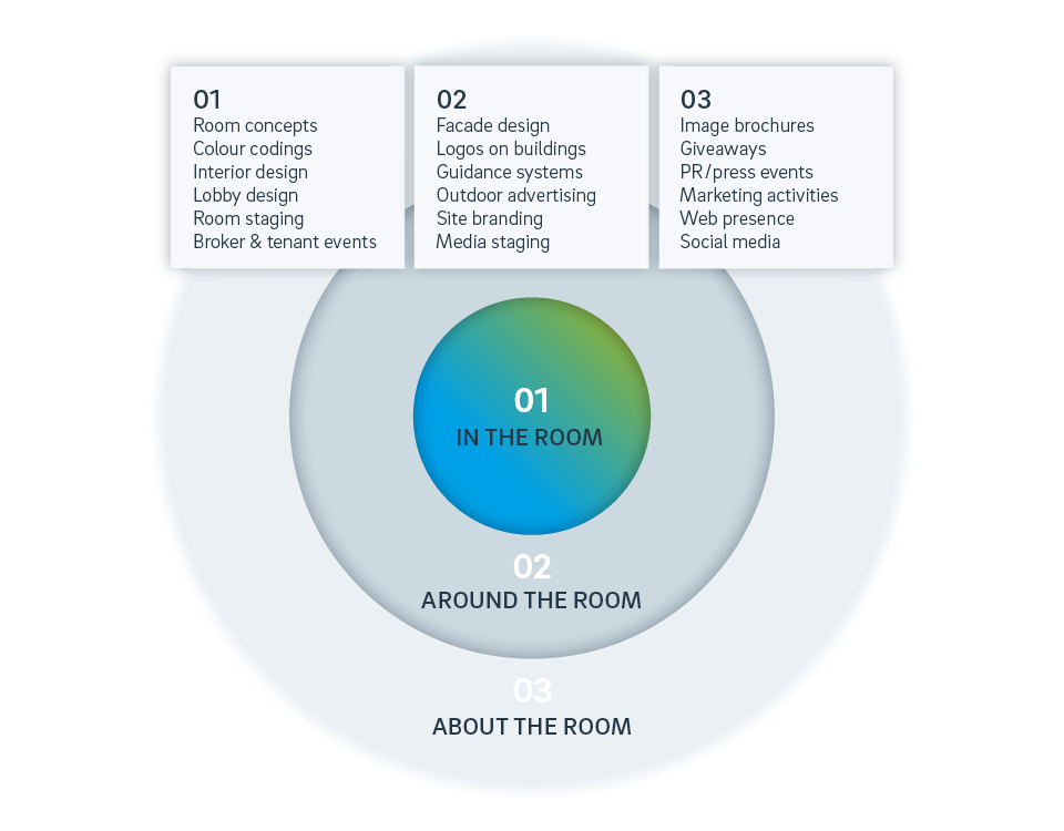
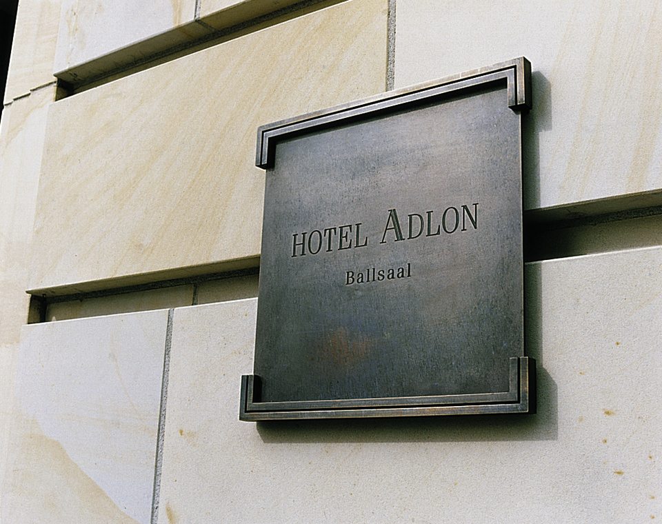
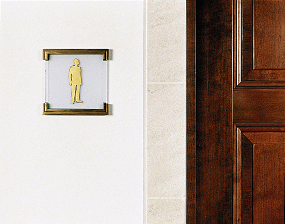
COMMUNICATION IN SPACES
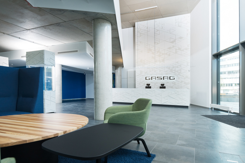
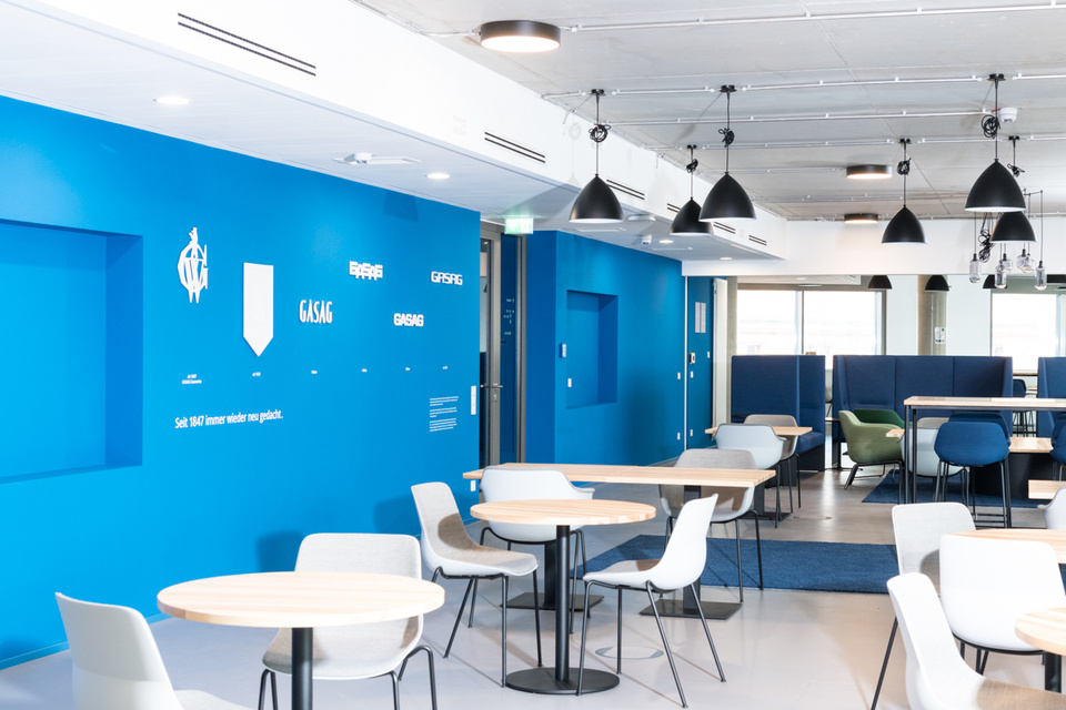
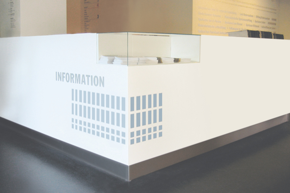
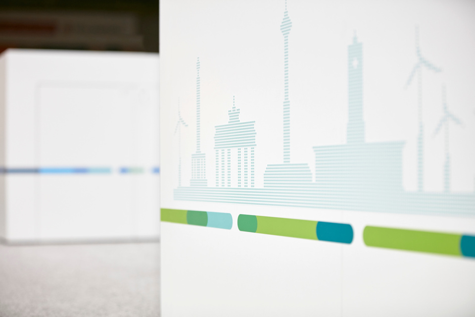
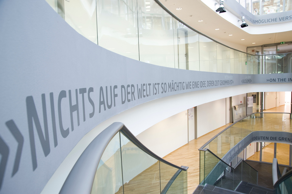
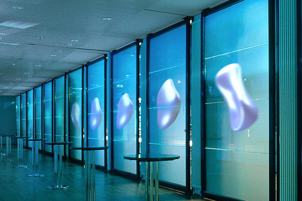
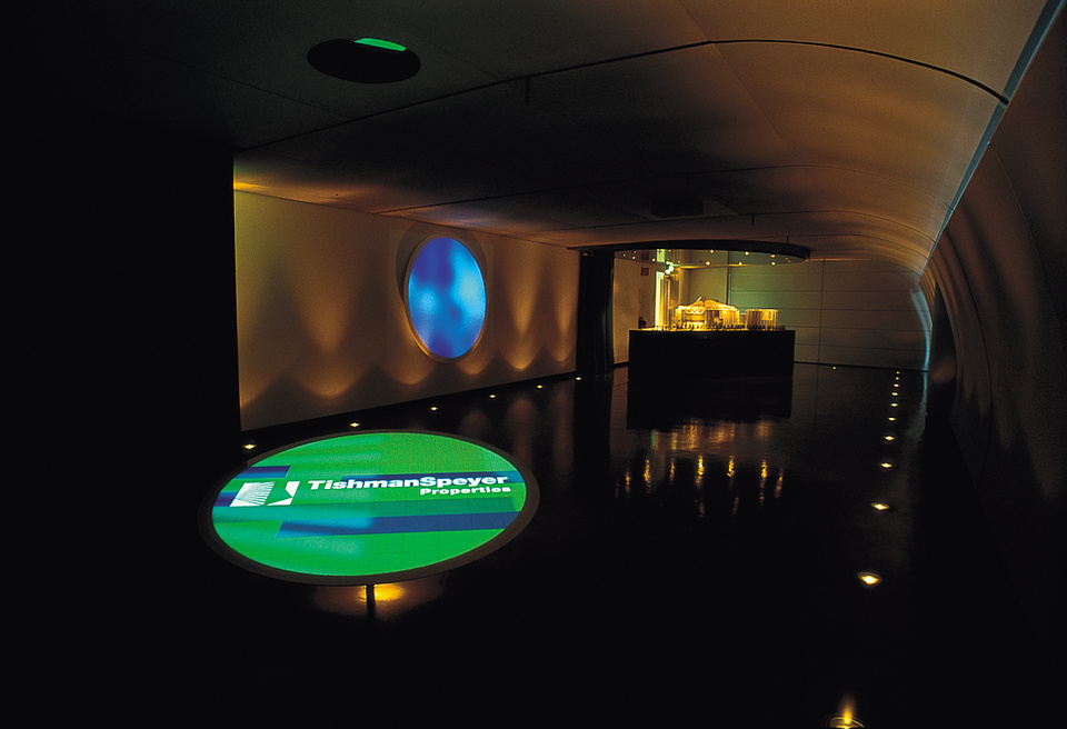
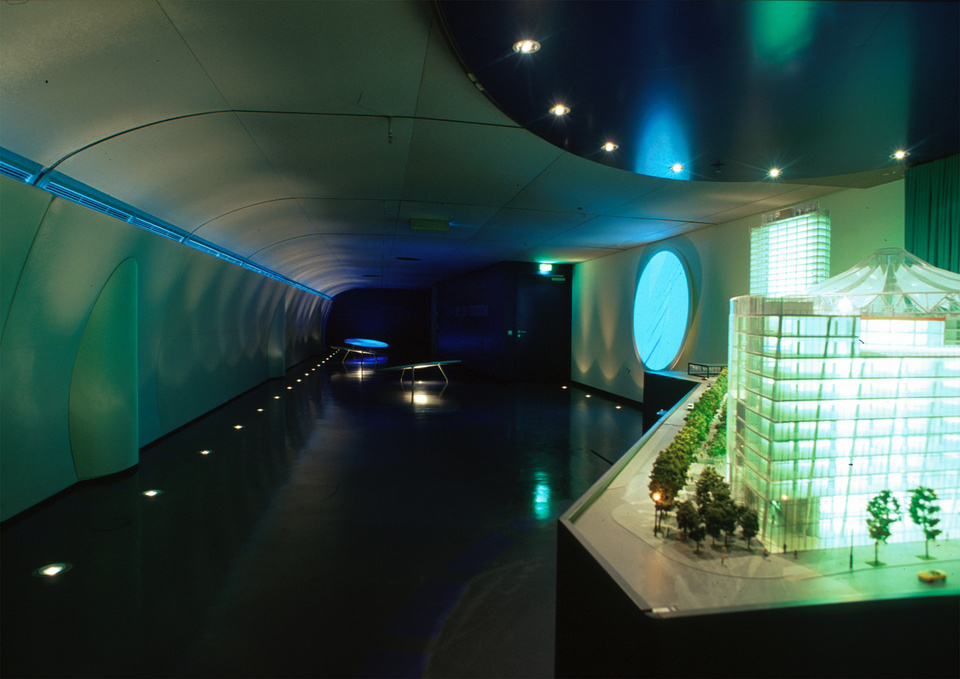
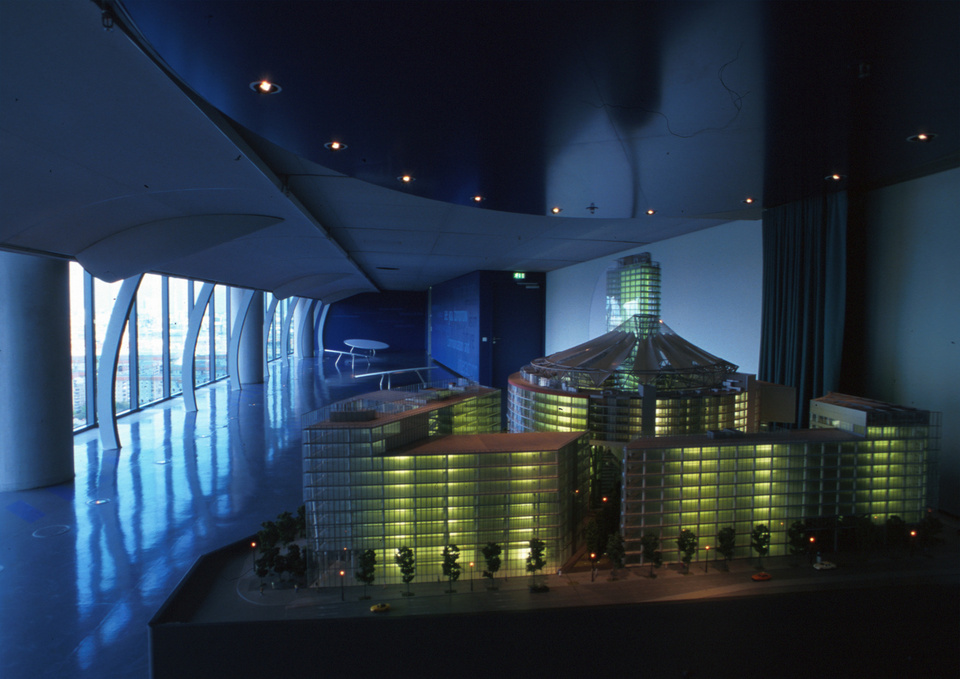
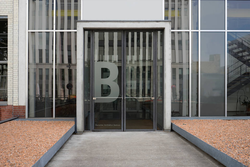
Communication in space means using the building and its architectural character and playing with the brand character. From lobby design, colour coding/zoning to interior design, there are possibilities to make worlds of experience and the brand world experienceable, to arouse curiosity and to generate attention and brand awareness.
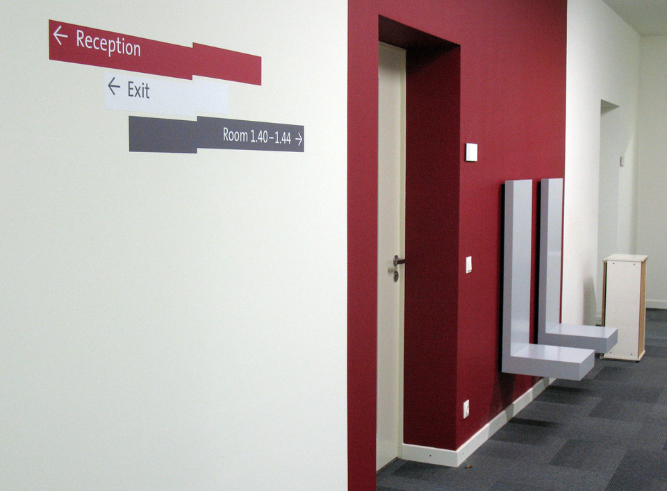
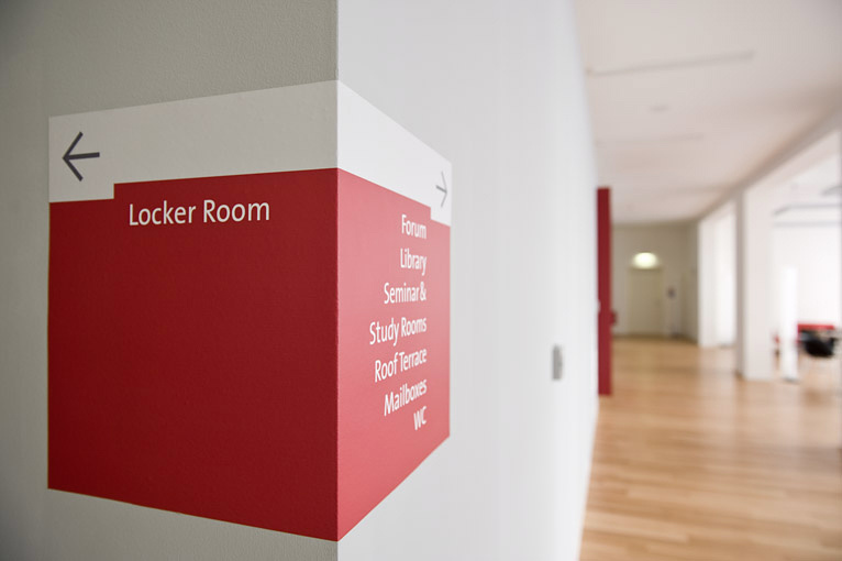
COMMUNICATION AROUND SPACES
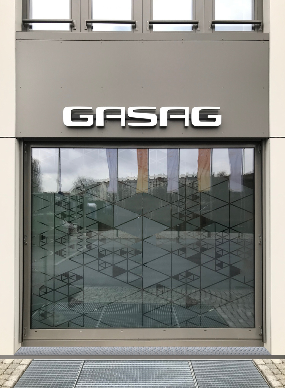
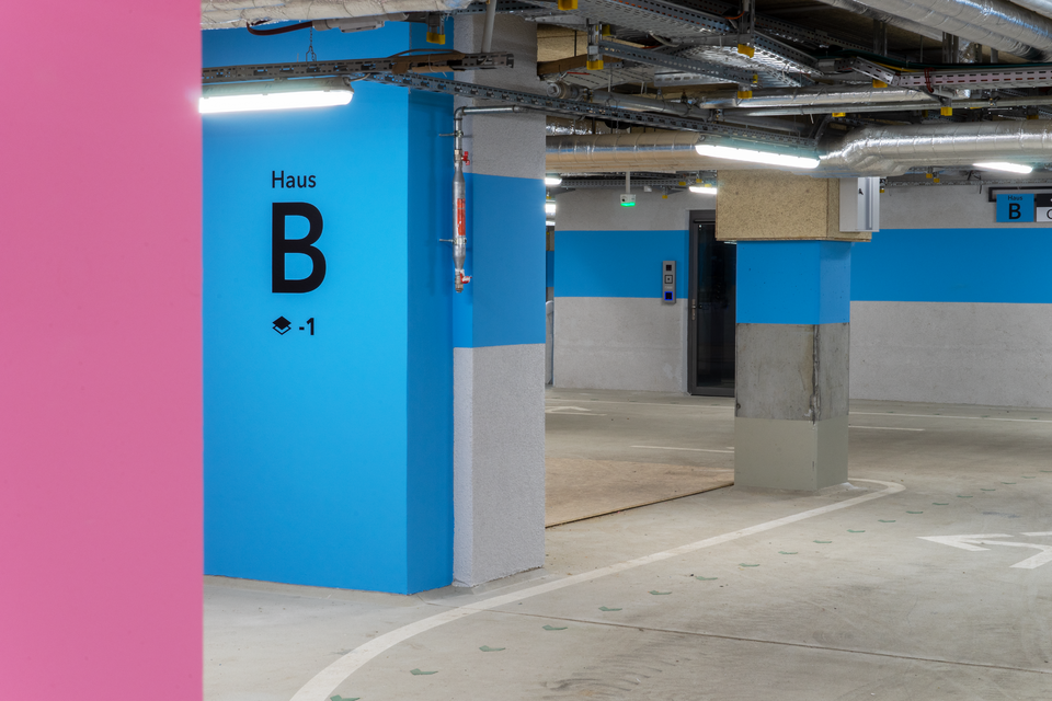
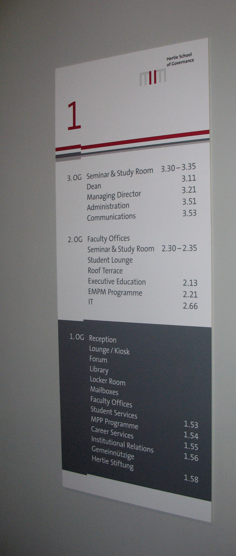
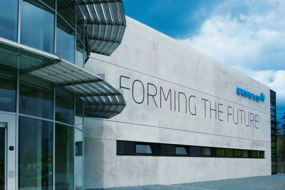
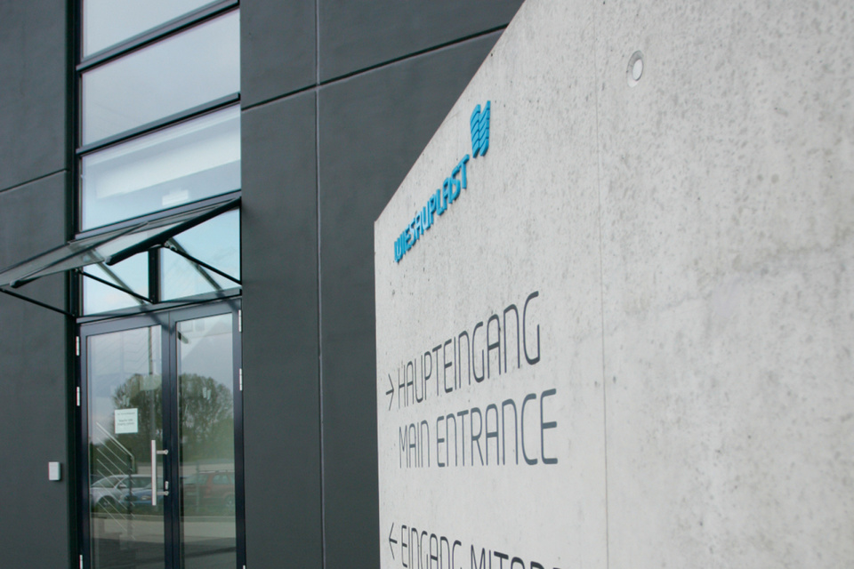
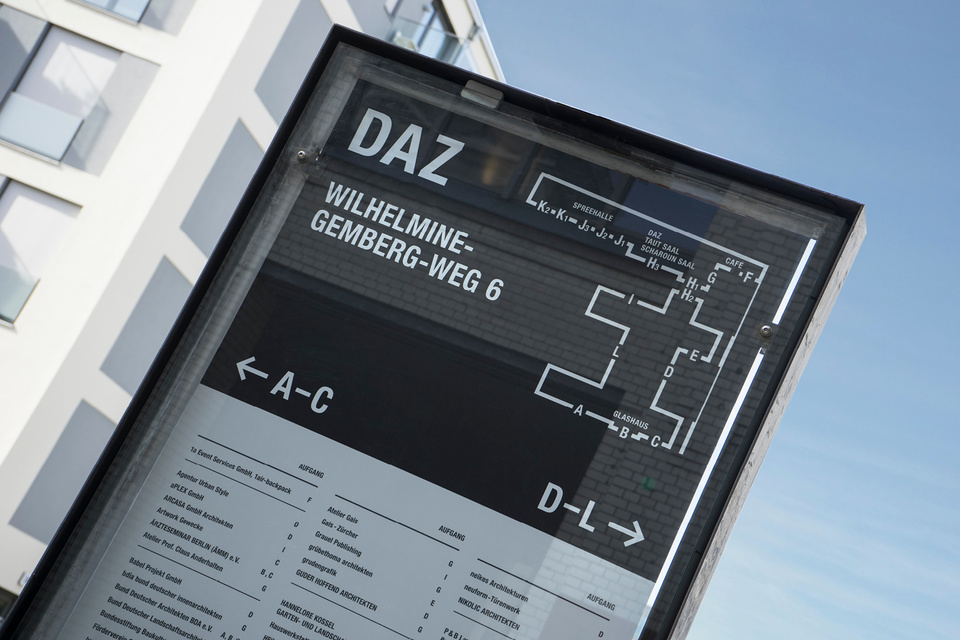
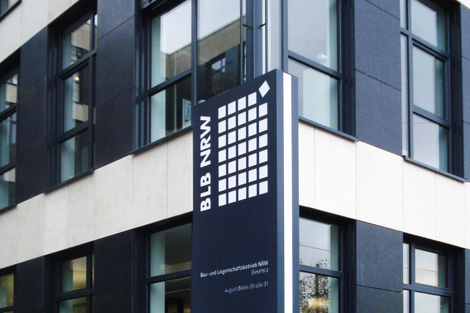
The location and the surroundings of the object play an important role - the object itself can also function as advertising space. A functional and aesthetic guidance system can serve to brand entire regions, districts or buildings and their surroundings. A quick and successful finding of the target will positively tune in to the real estate brand.
The real estate branding is ideally based on the appearance of the owner brand. This allows brand values to be conveyed - for example even during the construction phase. The building thus becomes an important brand touchpoint.
COMMUNICATION ABOUT SPACES
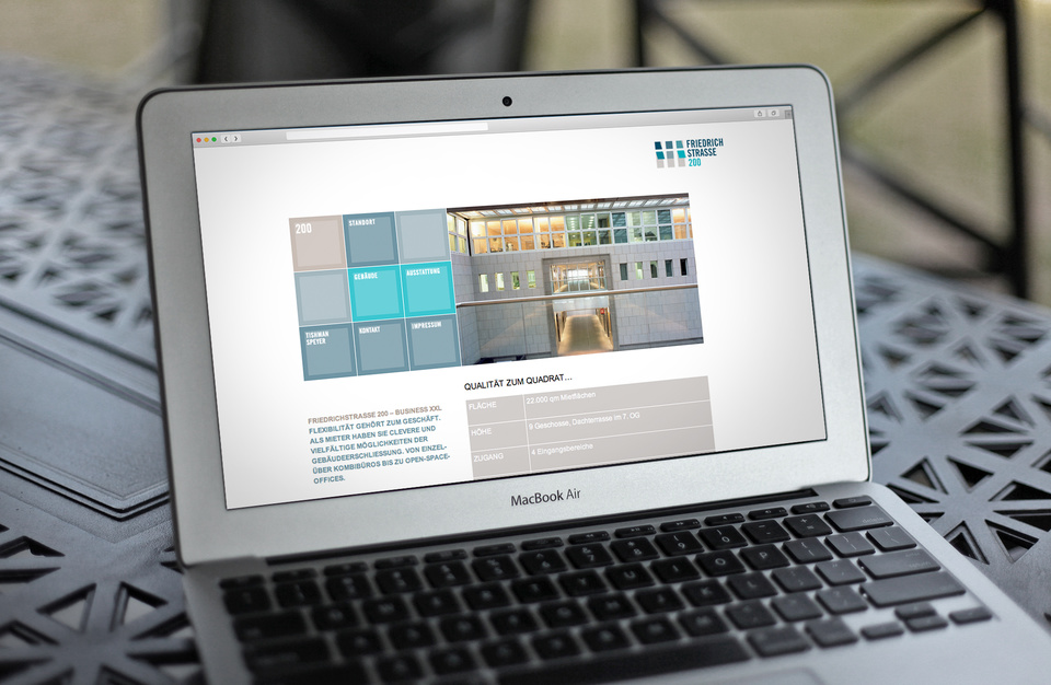
Communication across space means developing a positioning and formulating statements that stand out and reflect the defined brand character. An important role is played by the individually and appropriately chosen means of communication. The range of possible means that can be used is diverse: from image brochures, websites, social media measures, give-aways to marketing or PR events.

Three real estates in the FRIEDRICHSTRASSE in Berlin
The marketing of three objects in Friedrichstraße in the CBD of Berlin, which are located close to each other, was an exciting challenge. All three properties have the same microlocation, a similar architecture and were underutilised at the start of the project. In addition, they have relatively similar location advantages and product characteristics. Marketing was to take place simultaneously - without any "cannibalization effects".
In order to be able to position the buildings credibly and differently, an in-depth analysis is necessary - including the location, competitive offers, strengths and weaknesses of the buildings, opportunities and risks as well as the optimal target group(s). Thanks to its own company structure, PLEXGROUP has comprehensive insider know-how in this analysis and strategy phase, especially in the target group of architects.
Subsequently, the special features of a property and a clear positioning can be derived, the differentiation from the competition described, special and credible strengths identified and an individual and effective approach developed.
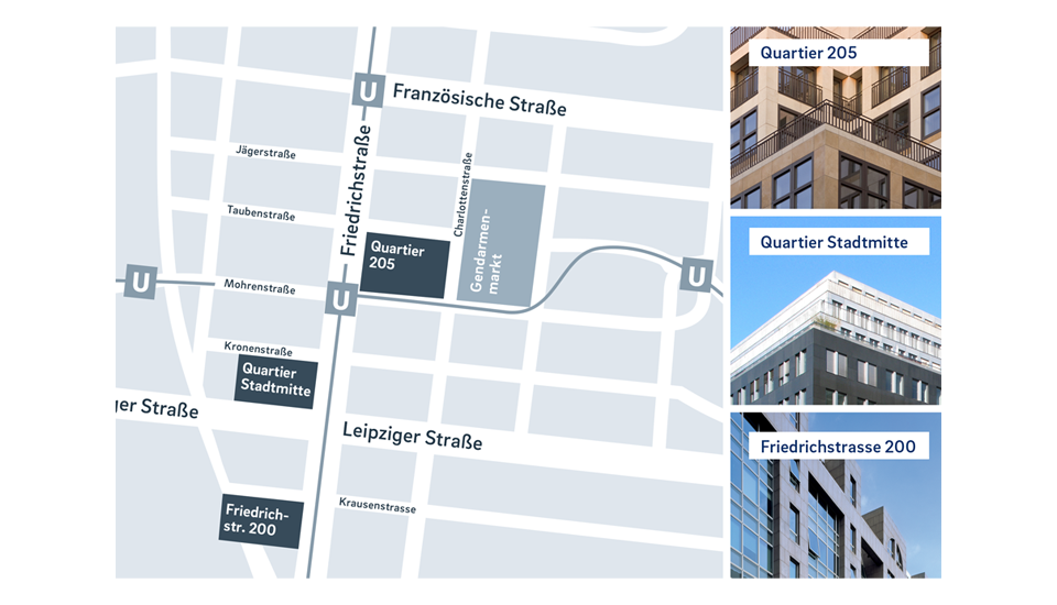
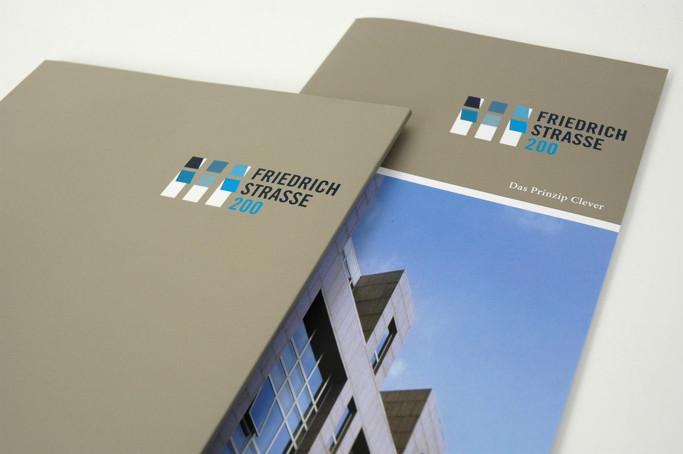
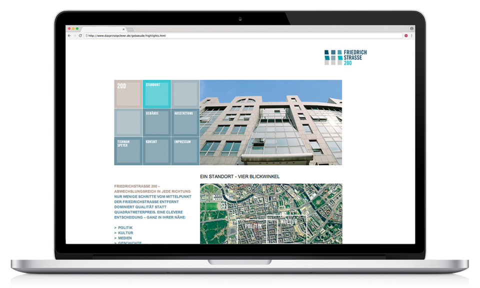
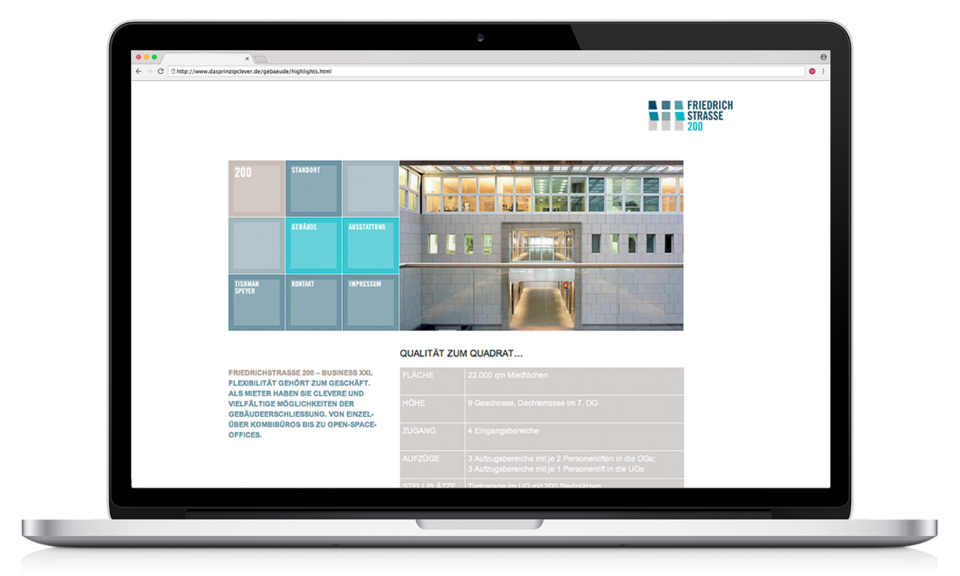
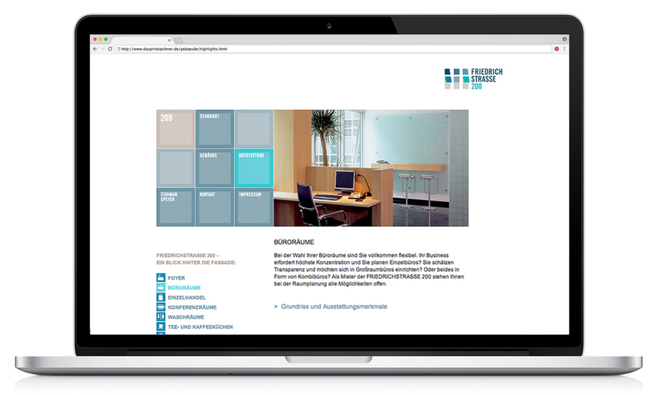
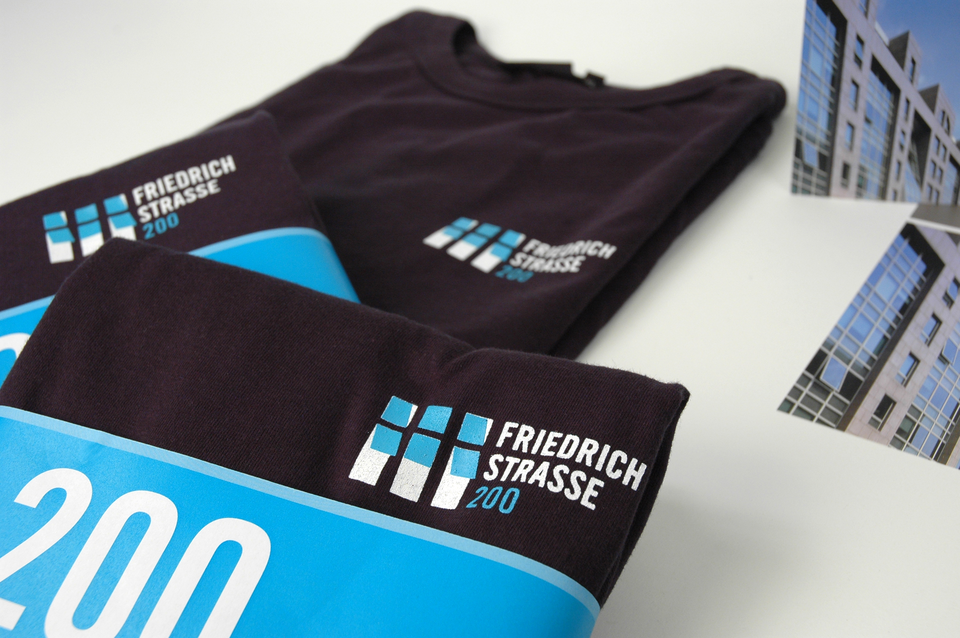
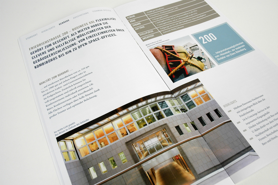
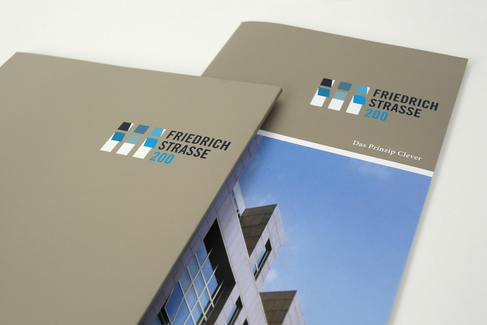
Friedrichstraße 200
THE CLEVER PRINCIPLE
A renowned business address with a relatively low base price
For strategic reasons, the address became part of the brand name. The word/image trademark "Friedrichstraße 200" is derived from the architecturally most striking element on the building: brick-like slopes visible on the façade. In communication, tenant events, give-aways, etc., the number "200" is used consistently and playfully as a typographical/graphic element. Recognizability and stringency are thus guaranteed for all means of communication.
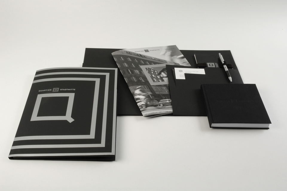
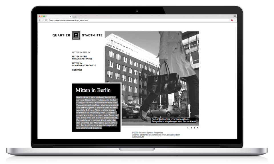
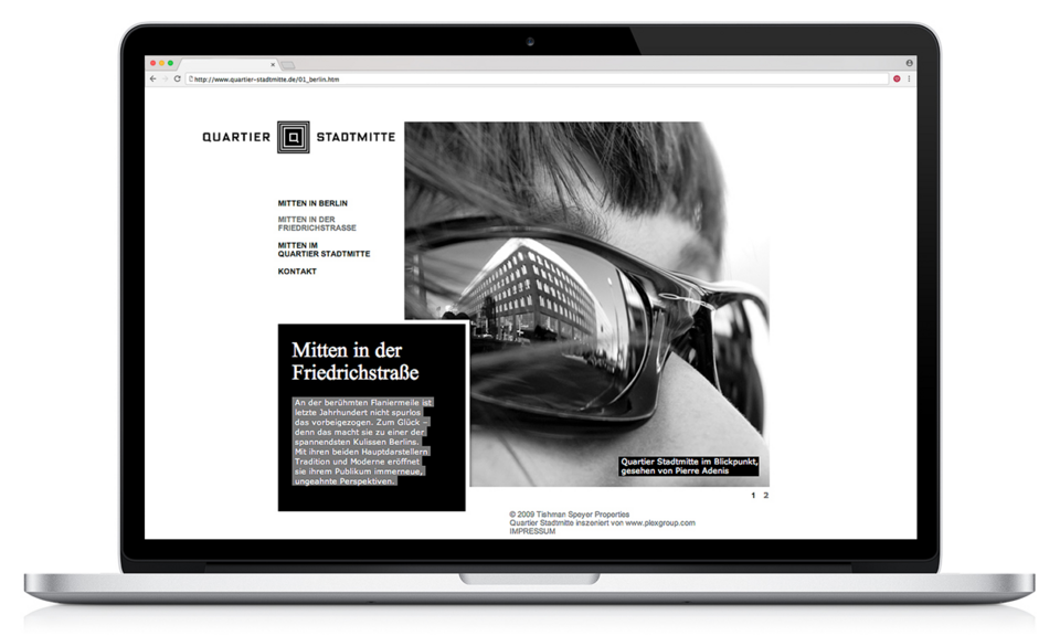
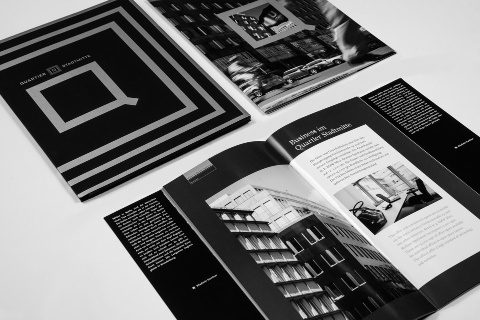
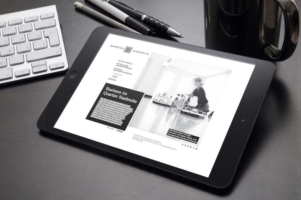
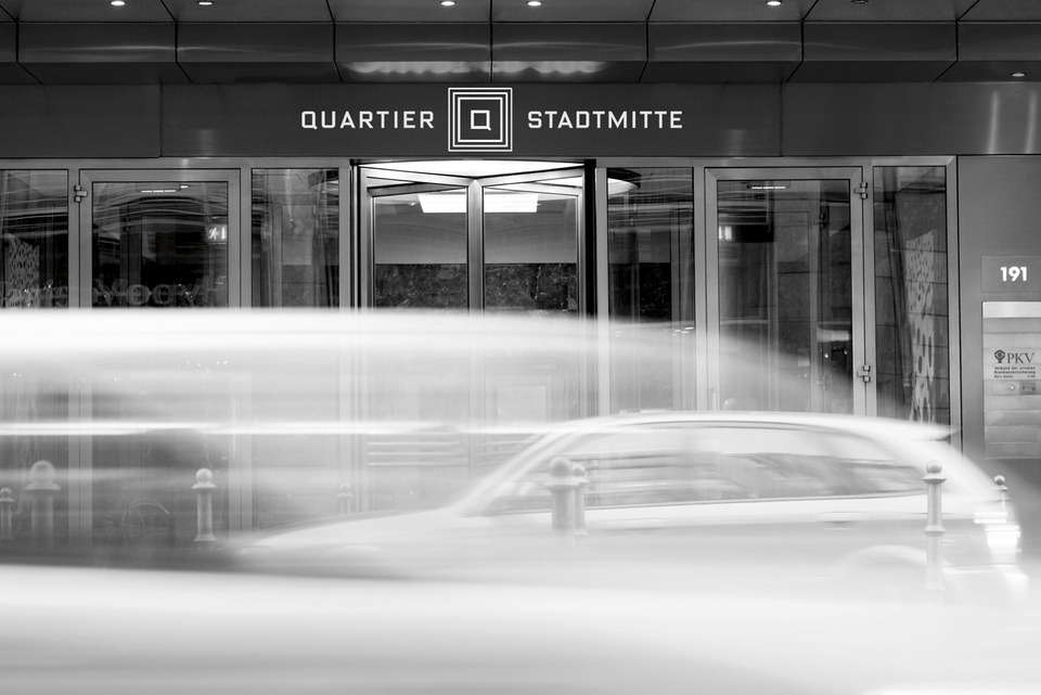
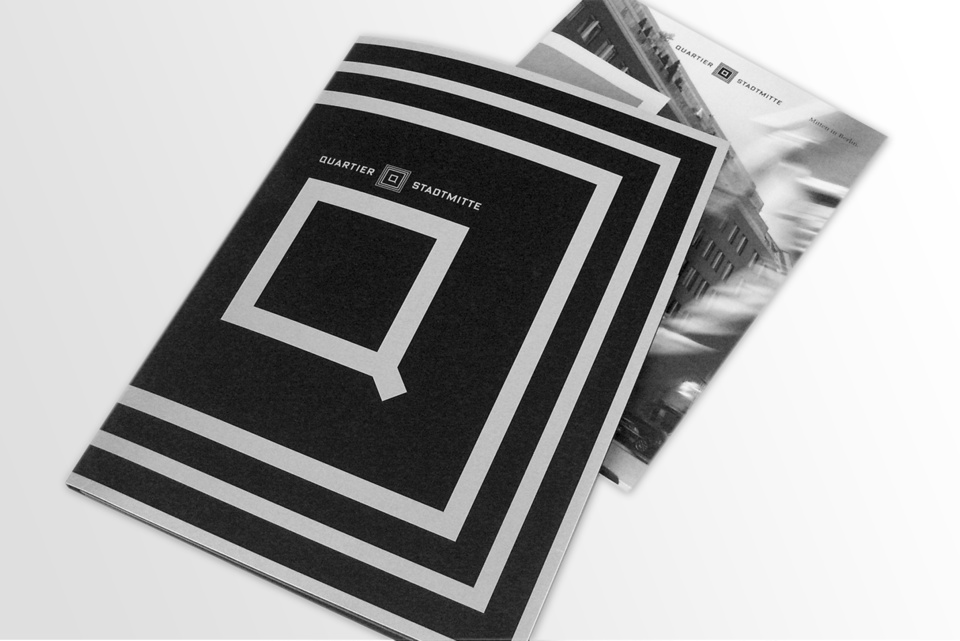
The Quartier Stadtmitte
The Principle of Class
Architecture with a classic claim in the mid-price segment.
The naming emphasises the fact that the building is located directly next to the Stadtmitte underground station. The name Quartier suggests high quality, the colour of the corporate design is derived from the black basalt facade of the building. The "Q" as a visual element of the brand takes up the square ground plan. The photo style was adapted to the communication and design concept during a comprehensive photo shoot. All texts were written by Wladimir Kaminer and describe Berlin life around the property in his well-known style.
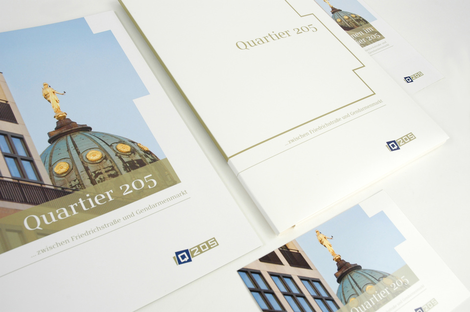
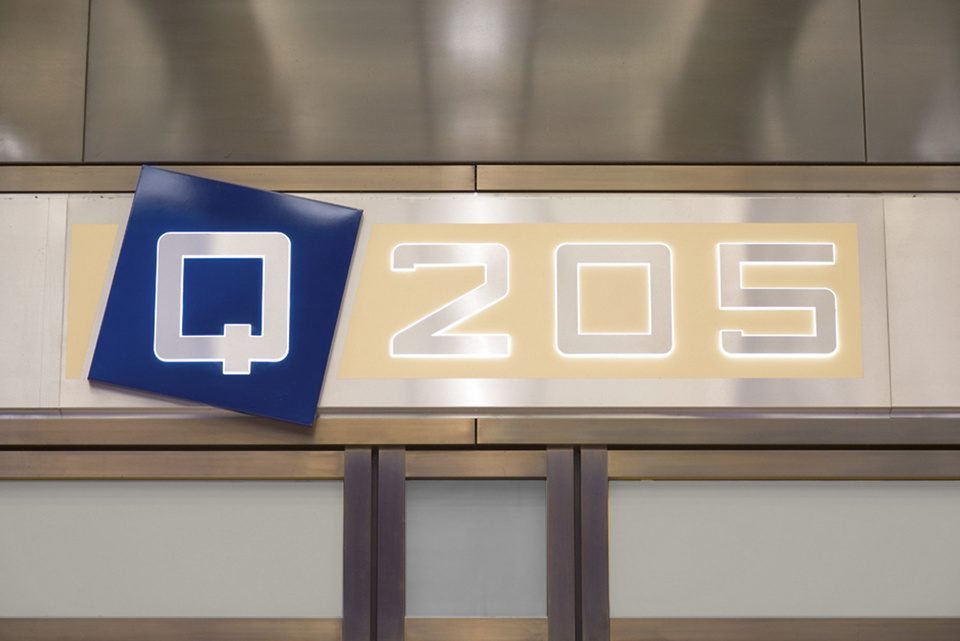
The Quartier 205
THE PRINCIPLE OF PRESTIGE
A stylish and high-priced address directly on Gendarmenmarkt - for tenants with high expectations.
Quartier 205 is located directly on Gendarmenmarkt and is the most prestigious of the three properties. This became visible in the design, the materiality of the advertising material and the choice of colours. In addition to brochures, the website and give-aways for tenants and interested parties were created.