Strategic
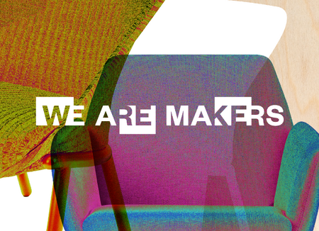
We guide brands from strategy to impact
We develop brands based on strategy. Building on this foundation, we create design, plan and implement brand experiences, and build brand spaces.
This is how we create brands that provide clear direction, project a consistent image, and build long-term value.
Our Services
Activating brands through strategy.
We develop brands based on a clear strategic foundation—as the basis for well-informed decisions, consistent communication, and sustainable differentiation.
Perspectives on branding


Cases
Our client portfolio is broad and ranges from foundations to industry, energy, automotive, interior design, real estate or exhibitions. With a focus on B2B and always Human 2 Human.
Independent and interdisciplinary
We bring together strategy, design, development, and architecture under one roof.